Title-Screen Buttons

I have worked on making a series of buttons for the title screen of our thus-far nameless game based upon the “Echo” concept document.

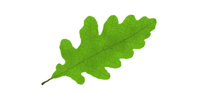
Ours is a game that takes place in nature, and I wanted the title-screen to be reflective of this. I made the buttons to be in the shape of leaves, partly to match the aforementioned nature-theme, but also simply because I like the vibrant green color and the pattern of the veins within them. I went specifically with oak leaves because they have a more interesting shape most other kinds of leaves, but still have an “elongated” shape fit to be the frame for short pieces of text.

I used a royalty free image from the site 123rf.com as a reference and then tried to imitate the look as accurately as possible.

Here is the specific image, if you are interested:

https://www.123rf.com/photo_22011553_oak-leaf-isolated-against-a-white-background-quercus-robur.html

Very specific link name, come to think of it.

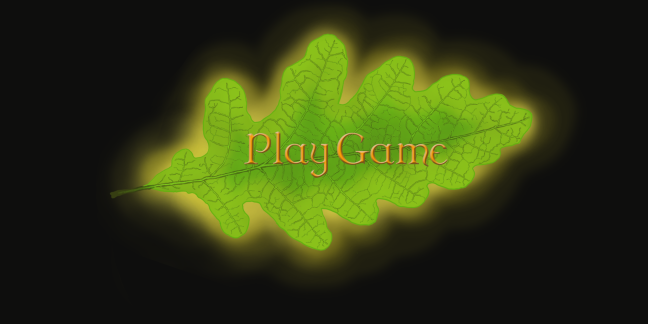
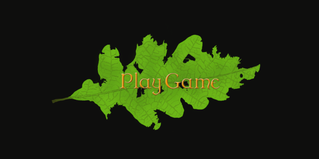
I wanted to have three versions of the button; one neutral, one active for when the cursor is hovering above it, and one for when it is clicked. Deciding how the active version would look was easy. I just had the leaf emit a warm glow. The hard part was coming up with how the clicked version would look. I toyed with the idea of simply having the glow change color, or having the leaf be a bit darker, as if covered in shadow. I scrapped both of those, however, as I felt that a palette swap of the glow would be to subtle, and that to darken the leaf felt lazy. Instead I made the leaf look torn and ragged in the edges, so that it would seem like, when clicking, something had actually touched it.

Some of my group mates was not too keen on the clicked version, but did not really give a reason as to why. My fellow graphics student gave it the thumbs up, however, so I didn’t change it yet.

The text will probably not look the same when the buttons are implemented, because the programmers felt that it would be better if the text was changeable in Unity, which I can understand. Maybe it is possible to make it look like this in Unity as well, but I’m sure that something equally nice can be done otherwise.

The text itself was interesting to make, since I had never used the text tool in Photoshop before. The font is called “Dungeon” and was downloaded from DaFont.com, another very helpful site. I made it look golden because I thought it would look nice against the vibrant green of the leaf, even though It clashes with the nature-theme somewhat.

I added a picture with the buttons atop the title-screen background I made a few weeks ago, but this will probably not be used in finished product either, since the team seemed to have other ideas.

Leaf TransperantLeaf Active w. Text and BackgroundGui Button Pressed w. background

Frog – Animations

This week I have worked on animating the frog enemy that I drew a couple of weeks ago. As of now, it is meant to be stationary, but I might have to make an animation of it rotating in place in the future, if that decision changes.

I have made one idle animation, as well as two versions of an attack animation, both in Photoshop. The idle animation is pretty simple, with the only movement being the eyes and the vocal sac inflating and deflating. I wanted to add movement to the frog’s forelegs, but it looked way to choppy so I scrapped that idea. I believe that it would look a lot better if I divided the frog into clip-art and used an animation program like Spriter2D, but I’m not sure how I would make the rest of the animation function, like the movement of the eyelids and pupils. It’s possible that it would work fine, I just haven’t had the time to experiment a lot.

I made the idle animation by making a layer for each frame and then drawing the changes I wanted. It was a pretty straight-forward process that ended up fairly well.

The two attack animations are of the frog using it’s tongue to try to catch the player. In the first one I made, I simply created a bunch of tongues in different states of extension using the lasso tool and the free transformation function, all on separate layers. Then I just made the correct one visible in the right order.

I made the second one because of the constructive criticism I got from another member of my group. He noted the distortion of the tongue’s shape due to the scaling differences between the frames, and suggested that I made another one where it remained the same size throughout the animation. I did so, although the process of making this one was a lot less streamlined than that of the first.

First, I had to divide the tongue in separate parts, to then build it up again throughout the frames of the animation. But I quickly ran into a snag. After finishing the first two frames, I moved the tip of the tongue up a bit, so that I could add the first part of the long, main body of the tongue. But I realized, that if I moved a part of the tongue in one frame, I moved it on all frames. So to solve this, I had to make multiple copies of every part of the tongue, merge the ones that would be together and then place them into the right position in each frame.

I’m probably not doing a very good job of explaining this right now, but since I procrastinated writing this post until the last minute, it’s kind of late and I’m tired. So sorry about that.

Anyways, I got the animation finished, but I realized that I actually liked the old one better, since it has a more “rubbery” feel to it, and it looks like it’s actually extending. The tongue in the second one, where the tip stays the same size, I feel wouldn’t fit in the frog’s mouth at all. We’ll see what the rest of the group thinks as well as which one looks best in Unity.

I’m pretty satisfied with the tongue itself, as well. I wanted it to look kind of gross, so I made it veiny and added some warts or blisters on the tip. They could also be wasp-stings, since we plan on making the frog able to eat the “Hunter”-enemy, which I talked about in a previous post.

I’m a little worried that especially the idle-animation won’t be visible in the game, since it is very dark. I suggested that it would be cool if we could make the eyes of the frog glow, to make it more visible and cool, but this idea was not particularly well-received, since glowing eyes would give away the frog’s position in the dark. I feel that this would add a modicum of fairness, though, since it will be a bit frustrating for the player to be killed by an almost invisible enemy. It’s one thing with the wasp, but this thing attacks at range, so it will likely be outside of the player’s field of vision.

Man, this got long-winded. Please comment below which attack animation you think is best, the rubbery one, or the stiffer one?

Title-screen Background

This week I have worked primarily on the Title Screen background for our thus-far nameless game based on the “Echo” Concept Document.

It is a relatively detailed picture, so it took quite a lot of time to make. I wanted it to invoke a sense of mystery, darkness and untouched nature.

I tried to create multiple layers of foreground and background so as to make the image seem as three-dimensional as possible, by, for example, having branches cross each other and drawing a set of trees behind the primary ones.

I wanted to make the image have as much detail as time would allow, so I added a couple of small things, like the frog enemy that I have previously drawn. I drew quite a few mushrooms growing on the trees, partly for looks, but also because mushrooms do not utilize photosynthesis as a means to gather nourishment, and the forest in our game is portrayed as extremely dark, so it would make sense for mushrooms to be a common occurrence. Although I also added green leaves because I wanted it to pop against the brown and black primary colors, even though that goes against my previous reasoning. But hey, artistic license and stuff, am I right?

I used a lot more different brushes while drawing this picture than I usually do. The lichen on the branches, the leaves along the middle treetrunk, the fireflies as well as the layer of darkness over the background are done with different brushes. It was quite fun to experiment with. The leaf brush in particular, was very helpful.

I showed the image to my group, and I got the suggestion from our Scrum Master that one could remove the fireflies, and then add them in Unity later, as a game object. This would allow them to move, and would make the image seen much more alive.

This made me wonder if it would be possible to add the upcoming animation to the frog on the left tree as well, since I believe I would have to remove it otherwise, since it would look very stale compared to the then mobile fireflies.

I would also like to add some of my group’s other artist’s moth assets, so that the main character of our game is shown on the title screen.

Enemy – Frog

After working on the hornet-like ”Hunter” enemy last week, I was tasked with designing another enemy. This time, it was a frog.
I have actually always liked frogs, so I had fun designing and drawing the asset.
Since we are going for quite a fantasy-like world, with a lot of non-realistic color schemes and patterns, I had basically free reign when deciding what it should look like.
Since our game is very dark, I wanted to make sure that the frog would easily stand out from the background. We have very little red in our game so far, so I thought that red would make a good starting point. I made it a very vibrant, bright red, partly because I wanted it to stand out, as I already mentioned, but also because red is a common color on Poison Dart Frogs. Poison Dart Frogs, for those lacking in their frog knowledge, are a group of extremely toxic species of jungle frogs.
Since we are designing the world to seem inhospitable and dangerous, I wanted the frog to seem poisonous, even though it probably won’t be represented in the game mechanics.
I chose green as a secondary color because the green spots would clash with the red base color, and make the end result more vibrant overall.
The eyes are yellow because I’m hoping to be able to convince the rest of the group to make them glow, in-game, to make the frog seem more threatening.
The pupils are drawn on a separate layer from the rest of the eye, so that I can easily make them move independently from the frog. I want them to be able to point in different directions, to open up possibilities for comedic facial expressions. This might clash with the overall tone of the game, though, so we’ll see how it ends up.

The frog is meant to be stationary, which is why I drew it in a sitting position, since the most movement I will have to animate, will be it rotating in place. I think that can be done by just having it move it’s feet a little, which is a nice switch from the hornet.
It will attack by whipping out it’s tongue, hoping to snare the moth that the player controls.
I was planning to draw the tongue in this image, but another group member suggested that we make it a separate entity, so I left it out.
The temperature shifts on the frog’s skin (Or is it texture? I’m still unsure about what exactly those are, and how to tell them apart) are actually made with a leaf brush, which can only really be made out by examining it closely. And since the frog is going to be relatively small on-screen, compared to these images, I doubt it will show in-game. It was very useful when trying to keep the pattern uneven, though. Added it above the frog in the picture, for reference.

Hornet/”Hunter” – Enemy

hornet-enemy-picture


During the last few weeks I have been working on a game project with the working title ”Echo”, along with my group. Echo is a game set in a world of insects, where you play as a  moth fluttering about in a dark forest, or to be more precise, the branches of a single tree, since you are so small.
I was to design one of the primary enemies in the game, a wasp or hornet that hunts the player if they get close enough to be spotted.
Since the enemy was called ”the Hunter” in the Concept Document, I strove to design something that looked aggressive and dangerous. To accomplish this, I used black and yellow as primary colors. I chose these for multiple reasons. First because they are normal colors for this type of insect, and the enemy would then be easily identifiable. Secondly, they contrast each other which makes the picture more vibrant. Thirdly, the color scheme would hopefully remind the player of their own experience of bees or wasps, and thus invoke a sense of apprehension.
I also made the pattern on the back of the wasp much more stylized compared to reality. I tried to make it reminiscent of the head of a monster or demon, with yellow dots that could be interpreted as eyes and having the top corners of the main pattern curve upwards to look like horns.
I gave it sharp barbs on each of it’s limbs for catching prey, to give it a more dangerous look, as well as having the tufts of hair on the antennae resemble fire.

I strove to make the wings seem fragile and thin, but didn’t think to have them clearly be separated until I started to animate the sprite.

Speaking of animating, I made two separate animations during this assignment, one for when the enemy is idle, and one for when it chases the player. The idle animation is relatively calm, and the wings are the only parts moving quickly. The rest of the body is just wagging slowly from side to side, and the antennae are twitching as to signal that it is searching for the player.
The chasing animation is much more aggressive. The body of the wasp is thrashing back and forth, and it is wildly flailing it’s front legs, trying to reach you to tear of your wings. It’s mandibles are snapping and the antennae are moving less, since it is now aware of your position.

I drew the image in Photoshop, and the export was far from perfect. There were a lot of artifacts, which I was not knowledgeable enough to fix. Luckily the sprite will be relatively small compared to the rest of the screen, and it will be very dark. Hopefully these factors will hide most of the flaws.

I used the program Spriter2D to animate the sprite, since as far as I know, using Unity was not mandatory. It was easy to use, which says a lot coming from someone as technically inept as myself. This tutorial was extremely helpful during the process:

Without it, I doubt I would have been able to figure it out in time.

The entire process from drawing the image, to dividing the bodyparts into separate layers (29 in total), to figure out how to animate it and lastly to actually do it, took quite a lot of time. But I think the end result was worth it. If I hadn’t divided the legs into three parts each, for example, the movements would have ended up looking far too stiff. hornetidle3hornetattack7